
The array and variety of visualizations in postgenomics are seemingly unlimited. Here’s a subset of Marc Vidal’s research group’s preliminary map of the human interactome, originally published in Nature, vol. 437, pp. 1173-78 (2005).
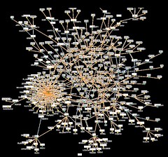
I don’t know why I find this kind of network patterns so alluring. Network pics like these probably help sell grant applications, in this case (says Vidal, “Time for a Human Interactome project?”, The Scientist, vol. 20(3), p. 46, 2006), “an investment of $100 million should be enough to correlate the genome with function, and identify new basic research and drug targets”. The one above reminds me of visualizations of co-citation analysis patterns (which were invented by Henry Small in the 1970s) , like this one:
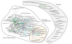
(from: http://informationr.net/ir/10-2/paper220.html)
Categories
Recent Posts
- Om hämnd — att hänga ut skitstövlar med namn
- Trettiofem livsöden, alla noggrant vägda på vår privata historievåg
- En atmosfär av lärdom, med genklanger av disciplin och ordning.
- Halvseklet efter min barndom känns som ett kortare tidsrum än kvartsseklet före
- Att sätta rätt rubrik på kapitlet om gymnasiet
- Mitt första intryck av dansk antisemitism
- De sex mest spillda åren i mitt liv
- Att göra sin ångest m.m. till en hobby
- Om glädjen i att kontakta gamla vänner och kolleger
- The memory of smell, atmospheres, and memoir writing
- Mitt behov av att klara mig själv
- Memoarskrivande som ömsesidig bildning
- Drömmen om den blåa dörren
- Min längtan efter Arktis
- Emerituslimbo
- Memoir writing keeps self-absorbtion in check
- Om memoarskrivandet och dödskonsten (ars moriendi)
- I’m eschewing new life experiences
- Yet another argument for memoir writing
- Is memoir writing a socially irresponsible activity?
- The life course as a process of punctuated equilibrium
- Att vara en när-/frånvarande far
- Visualization of my publication record
- Scientific memoirs as stories of personal decline
- Är Houellebecq’s Soumission verkligen satir?
- En dröm om att ge avkall på sitt barn
- An image that encapsulates my life
- Det börjar sina med nya fakta från 1950- och 60-talen
- ‘Diminishing returns’ i biografiarbetet
- Insikter om begränsning som varat hela livet
- Hur en homoerotisk dröm kan bryta en skrivblockering
- Mina (minst) tio akademiska identiteter under 50 års tid
- Om intellektuell otrohet
- Studier i grekiska — de två mest underbara åren i mitt liv
- Om lukten av paradis
- The point of museums is to play with material stuff
- Do you throw personal stuff away?
- The muse is political — the museum is political
- What do you call events that signify a specific year on the timeline?
- Objective time in autobiographical writing
- The memory of atmospheric smell
- I can’t recall a single meal –
- Writing memoir for publication or for the desk drawer?
- I was a mistake
- Ethical considerations
- Fox or hedgehog?
- Canities — what’s that?
- The earliest memories — the act is lost in oblivion, but the metaphor remains
- Vetenskapshistoria som skönlitteratur
- Dreaming about Jacques Ellul
- Böcker som har forändrat mitt liv – Konrad & Szelenyis Die Intelligenz auf dem Weg zur Klassenmacht
- Counter-factual autobiography
- Money in the archive
- Moral and emotional self-spanking
- Jag öppnar dörrarna till minnesrummen
- Episodic memory and narrative reconstruction
- Time to take stock
- (Museums)kultur som branding- og marketingsværktøj
- The making of Femme Vitale
- "Anatomy, art and the body" — Copenhagen symposium on Vesalius' 500th anniversary
- Materialitet og sanselighed — om at bryde visualitetens tyranni på museer
- Science in the Arts seminar at Medical Museion on 9 April, 1-2 pm
- Galen som geometer og læge
- Touching The Tactile — workshop at Medical Museion, 10-11 April, 2014
- "Så tæt på hinanden som ordene Leber og Leben"
- Vetenskapsmuseer och den materiella vändningen i humaniora – biopolitisk abdikation eller medborgarengagemang?
- Thomas Söderqvists tale ved åbningen af MEDICOTEKNIK, 27. november 2013
- Prodekan Birthe Høghs tale ved åbningen af MEDICOTEKNIK, den 27. november 2013
- Er det ubetinget godt at blive ved med at være nyskabende og nytænkende?
- Forskning og livsløb – har kreativiteten en udløbsdato? Debatdag på Medicinsk Museion den 8. oktober.
- Social media, research and museum curatorship — a concrete example
- The material life-course of a scientist
- Hybrid Psychiatry Room (beta version) in Medical Museion
- Verdensklasse, verdensklasse, verdensklasse …
- Is Yammer really an appropriate communication tool for universities?
- The Data Body on the Dissection Table — a joint Leonardo/Olats and Medical Museion event
- Guest lectures at Medical Museion: Massimiano Bucchi, Morgan Meyer and Bruno Strasser
- Collecting and displaying healthcare ICT — are medical museums ready for the future?
- Taking down exhibitions can bring us closer to the objects than building new ones (and create more fun)
- The colour historians were here
- Taking down exhibitions is almost as fun as building them up
- Human remains — constructing the 'Under the Skin'-exhibition
- The substance of fat – a multisensory event about fat
- A research spirit and experimental attitude in museums
- Vi har mistet vores publikumsmedarbejder, Anni Harris
- The material life-course of a scientist: are biographical exhibitions possible?
- Opening the biohacking lab at Medical Museion
- Objects that were demonstrated, touched, fingered, fondled, caressed and stroken at the tactile aesthetics seminar yesterday
- Everyday objects you enjoy touching — investigating tactile aesthetics
- Museums Showoff next Thursday — including "Why the very idea of a science museum is just plain silly, but if we’re going to have them they should be less like Harrods and more like a junk yard"
- Danish postdoc fellowship in art and biosciences
- Creating life: from alchemy to synthetic biology
- De udviklingshæmmedes, børnehjemsbørnenes og de sindslidendes historie i perioden 1945-1976
- Ambient plasticity: aesthetics of the hospital
- Mannequins in museums — their present use, aesthetic reactions and history
- Is collecting contemporary historical objects a 'risky business'?
- Caterina Albano on Fear and Art in the Contemporary World — a good topic for a medical exhibition
- Hvorfor spørge to kolleger – når du kan spørge 2000?
- Sandra Dudley is giving a seminar on object-centred work in museums (Copenhagen, Thursday 15 November)
- Cross-fertilisation between sci comm and STS
- Putting the magic back into medicine
- Medicin 2.0: Sociale medier i medicinsk forskning og praksis — møde på Panum, mandag 29. oktober, kl. 14-16
- Prevention and treatment of obesity — event at Medical Museion, Thursday 18 October at 6.30 pm
- Min tale ved åbningen af udstillingen "Fedme: hvad er problemet?", den 3. oktober 2012
- Dekan Ulla Wewers tale ved åbningen af udstillingen "Fedme: hvad er problemet?", den 3. oktober 2012
- You Need To See This — Pushing the boundaries of scientific visualization
- Poppy's milk so bitter, so sweet
- Who is (are) anonymous MuseTrain? Is it this EU-Turkey project?
- At være et museum i særklasse — hvad betyder det?
- The future of health science communication — the menu version
- Er de historiske artefakter virkelig på vej ud af Medicinsk Museion?
- Never attend a conference that extends the deadline of abstract submission
- Hunger, appetite, and satiation
- From the body as factory to eating information: A short history of metabolism
- Nærkontakt med en gentest — af den materielle slags
- The inability of contextualism to explain disruptions and surprises
- What would a material history of drug addiction read, look, sound, smell etc. like?
- Sociale medier og folkesundhedsvidenskabelig forskningskommunikation 2.0
- Examine first, ask what it is later — comments on David Pantalony's talk at Medical Museion
- Hvor foregik forskningskommunikation 2.0 egentlig på PCST-konferencen i sidste uge?
- Deep lacerations, inflicted in the blink of an eye
- What does a scientist look like?
- Are museum rooms without social media enhancement really 'stupid'?
- Biomarkers — an impossible topic for an exhibition?
- Best of the museum web in 2012
- What would a list of critical questions about the current financial crisis in the museum sector look like?
- Attending academic conferences is a waste of time, money and environmental resources — and intellectual energy
- Artificial insemination
- April events at Medical Museion: Lucy Lyons, David Pantalony, and Lars von Trier's Epidemic
- Deadline for nominations for the Dibner Award for Excellence in Museum Exhibits is May, 1
- Boredom is unattractive — but maybe nonboredom is worse?
- Jack the Ripper-kniv
- Hidden Stories — the biannual European medical museum conference in Berlin, 13-15 September 2012
- Why is it so hard to move beyond the deficit model?
- The aesthetics and politics of specimens on display
- Vores vision
- In Medias Res: The aesthetics of scientific, technological and medical things
- Save the human anatomical heritage!
- Scientific/technological artefacts and nationality
- How can we dare leave to secure warm, fuzzy email universe and begin taking academic discussions online.
- Displaying stuff at the nanolevel in museums
- Hvordan Storify kan bruges i daglig forskningsformidling
- Heldagsmøde om sprog, sygdom og sundhed i historien
- The biological and biomedical challenge to the humanities
- Åbne op for den æstetiske produktionsproces
- 6229
- Progress in medical science and technology?
- Planning our Sensuous Investigation Room for close encounters with material things
- At the margins of life and death
- Mundane design vs. fine sci-art: two realms of aesthetic practice in science communication
- The nice and fuzzy feeling of TED talks
- MUSE seminar #1: From Material Culture to Material Heritage
- MUSE-seminarer for alle der er interesserede i forskningskommunikation
- Skybruddet i juli kostede meget
- Follow our staff at the ScienceOnline conference in Raleigh on Twitter
- Museums, materiality and global politics
- Museum Boerhaave saved until 2016
- Medical Museion 2011 highlights
- The Polytechnical Museum in Moscow — a gem for technical museum aficionados
- To give means to give something of yourself — holiday greetings from Medical Museion
- Want to work with collections at the Florence Nightingale Museum in London?
- Anatomical collections as cultural heritage
- Dialogue about science communication
- The 'material turn' — why aren't museums and collection curators collaborating more with humanities scholars?
- The problem of exhibiting pain still hasn't been solved
- How to exhibit moral change in a museum?
- Nu må ODM sørge for at formidlingsseminarerne bliver mere brugerdrevne!
- How do we exhibit globalisation of medical technology?
- Effects of careerism in biomedicine
- Æstetik, læring og menneskesyn
- Narrativity in exhibition making — the current enthusiasm is problematic
- Advent medicalendar
- Why it's so good to be a university-owned museum
- Frosten lægger sig over kulturlandskabet
- History of science in science museums and science centers
- Was there science communication in the days before Twitter?
- What's the role of medical museums in the emerging biosociety?
- Den embryologiske forfaldsæstetik
- What is the use of the genre of biography for understanding contemporary biomedicine?
- Kulturhistorisk vandalisme truer verdensunik embryologisk samling i Lund
- The exhibition as a cross-disciplinary interface between scientific research and public engagement
- Narrativity and medicine
- Who owns the data collected from implanted monitoring devices?
- ScienceRoll 5 years today
- Sydsvensk medicinhistorisk billedarkiv
- A historian of science's dream job
- Livets Museum åbner snart i Lund
- Reconstructing scientific experiments for didactic purposes may have unintended side-effects
- How do containers embody scientific knowledge?
- Radio-trailer om 'Balance og stofskifte'
- Is the notion of scientific citizenship elitist?
- Next Universeum meeting in Trondheim in June 2012
- The difficult art of short scientific explanations in exhibitions
- AIDS 30 år — udstilling på Riget
- It's not the museum visitors' job to know what they want to see
- The sensuous dimension of scientific and technological objects
- Collection Impossible: Distributed curatorship and crowd-sourcing as alternatives to centralised collecting
- Speeches at the opening of the 'Balance and Metabolism' gallery and the 'Genomic Enlightenment' installation
- The productivity of intellectual enemies
- Waiting for medical museums to become less apolitical
- Støtte fra Arbejdsmarkedets Feriefond til udstilling …
- PS — men udstillingsområderne er fortsat åbne
- Pga vandskaden kan vi foreløbigt ikke udlåne eller modtage genstande, besvare forespørgsler eller sælge billeder
- Er det nu så smart at koordinere ansøgninger indenfor museumsforskning?
- Live-tweeting from Artefacts meeting in Leiden
- The moral discipline of curatorship
- The fascinating world of blog spam
- The reopened National Museum of Health and Medicine in Silver Springs, Md. — hope it's better this time
- Public health science communication 2.0 — new blog
- There's no cure for curiosity
- Synthetic biology — science, art, design
- Curating heritage through games?
- Moral aesthetics and moral constraints in representing and replacing bodies
- More on best practice in organising academic meetings
- The jizz of museum exhibitions
- Anatomical collections as part of the cultural heritage
- Configuring future scholarly communication — getting into the heads of current undergraduates and graduate students
- 16th biannual conference of the European Association of Museums of the History of Medical Sciences (EAMHMS) will be held in Berlin, 13-15 September 2012
- Can you display pain without lesion?
- Artefacts meeting in Leiden — final programme
- Mundane design vs. fine sci-art as two realms of aesthetic practice in science communication
- What's the role of academic museums in today's Europe?
- European anatomical collections network initiative
- 'Flotte' æbler og 'spændende' konferencer
- Greenaway has got it wrong: there is no 'visual illiteracy' — but there is a widespread 'material illiteracy'.
- Are science and society frenemies? And what, if anything, does this mean for sci-med-tech communication?
- Public health science communication through social media
- Tenure track job in history of medicine at Yale
- The medical history background for the Oslo terrorist action
- What shall I say about university museums?
- Summer vacation
- Next Universeum meeting will take place in Trondheim in 2012
- Museer og politik
- History of science blogs and Twitter accounts
- Care of self and keeping track of one's identity
- Wet to the bone — saving Medical Museion's collections after the Copenhagen cloudburst
- 11th annual conference of University Collections and Museums (UMAC)
- Anatomical and pathological collections in contemporary medical education
- Collection impossible: distributed curatorship as an alternative to centralised acquisitioning
- What shall the new medical galleries in London's Science Museum look like?
- Morbid Anatomy — a satanist blog?
- Nu går Nordisk netværk for studier i narrativitet og medicin igang
- Museum objects and poetry
- Impatient discovery vs. mature understanding — revisiting Ragnar Granit's view of the goal of scientific work
- Museum Boerhaave is threatened
- Fluttering brains
- Want to do short-time (
- The DIY biotech movement is working up steam
- Twitter journal club — II
- Promoting best practice in academic meetings
- Public communication of science and technology
- Journal clubs on Twitter
- Malling-Hansen's Braille writing ball on display
- Categories and concepts in health, medicine and society
- Museums on Facebook — making friends, making fans or simply broadcasting?
- The Museum of Technology in Hemel Hempstead
- Genomic jewellery — an Illumina BeadChip necklace
- Conceptualizing, collecting and presenting recent science and technology
- Madness and museums — collecting and exhibiting the history of psychiatry
- Analysing museums beyond the national framework
- New metaphors for sci-tech-med museums
- Things in culture, culture in things
- Remembering Horace Judson, author of The Eighth Day of Creation
- New assistant professor in medical science communication at Medical Museion
- Internationalisering er meget mere end ICOM-komitteer
- Our new social web and biomedicine staff member
- Workshop on the sensuous object (smell and touch, ambience, aesthetic, visual thinking, tacit knowledge, sound and seduction), 29-30 September
- How to use museum collections in teaching history?
- What is 'biomedicine'?
- Museums use social media mostly for marketing reasons and PR
- Collecting the voices and materials of genomics
- Another packed programme for a Universeum meeting — when will they ever learn?
- Forskningsformidling via sociale webmedier forenkler ikke budskabet — tværtimod
- Why do STS?
- One-day meeting on 'Curating science', London, 6 May
- What intellectual and practical approaches should be developed to document and preserve the history of recent science and technology?
- Martha Fleming on "Museum as Material, Exhibition as Scholarly Publication” at the Danish Royal Academy of Art, Friday 1 April, 1-3 pm.
- Can someone tell me what "a heuristic device waiting to be filled with meaning" means?
- Martha Fleming taler om "Museum as Material, Exhibition as Scholarly Publication” på Kunstakademiet på fredag
- What's actually meant by the "life" and "biography" of new materials?
- Studies in disposable culture
- Who shall have the Dibner prize in 2011?
- Historicisation — a postgrad course in Bergen next August
- The Picture a Museum Day event yesterday — see Medical Museion's pictures and photographers here
- What kind of social studies of science publications would convince scientists themselves?
- The moral economy of science communication
- Blog on the history of neurology and the neurosciences
- The material basis of a unified self
- The order of tangible things at Harvard
- Companies preparing skeletons for schools in the early post-war period
- Skal forskere tvinges til at skrive blogposter?
- Fastelavnskostume á la Penkowa
- Museum exhibitions between labour and grace
- Beyond science journalism — the web and new forms of communication power
- New web technologies for biomedical self-presentation
- The perfect journal — it's all about rejection
- The materiality and sensuousness of fat
- Identity: how little we actually change over time
- En Leonardo for det 21. århundrede?
- Are bioart works ever 'finished'?
- Egyptian prosthetic devices
- 2010 Medical Blog Awards goes mainly to earlier winners
- Hvorfor sætter danske videnskabsjournalister mure op for kommentarer?
- The transhumanist freak show
- A manifesto for creating science, technology and medicine exhibitions
- On queer museums
- Postgrad course on gendered body visualisations
- Don't make art out of the evolutionary heritage, please!
- Can you display the anarchistic attitude in science with the help of material and visual objects?
- Open access = closed access?
- A back-to-basics manifesto for creating museum exhibitions
- Vision and touch — a material history of blindness
- Google Art er som sex på skærmen
- Pris til bedste fysiologihistoriske artikel til en af vores KU-kollegaer
- Should museums help us live better lives?
- Hvad er god videnskabelig praksis for formidling i medierne?
- Harry Marks
- Genetik 3.0? Nej, langt fra
- The museum curator's dream: "Touch tells you what you need to know"
- Conference hodgepodge — everything 'laboratorial'
- Nordisk netværk for studier i litteratur og medicin
- Any experiences with shtyle.fm?
- Visual representations of professional cultures in biomedicine
- Medicinsk Museions nye SWAT
- Nyt netværk for "inventors, thinkers, engineers, geeks, tinkerers, modders, conceptualists, designers, hackers, makers, artists, and all those creating experiences for others"
- Værktøjskasse for outreach
- Living your scientific life as if you were a member of an aesthetic movement
- The life-span of a scientific article
- 12th annual meeting of the European Academic Heritage Network (Universeum), Padua, 26-29 May
- Er plastikdukkene ægte eller ej?
- Ægte lig? Hvor meget "ægte" krop er der egentlig tilbage efter balsameringsmaskinen?
- We are looking for a new academic member of staff for web-based science communication
- Vi søger en specialist i webbaseret forskningskommunikation
- Identity museums
- Political economy is too important to be left to biomedical scientists
- Psykiatrihistorie i Deadline i aften
- Merry Xmas from Medical Museion's anatomical theatre
- God Jul og Godt Nyt År fra Medicinsk Museions anatomiske teater
- 'Digital' evolution in two minutes
- The intensive care unit on display
- Facebook face images
- Beware of the Agambians
- Is digital information material or immaterial?
- Hvilke farver skal der være på væggene og panelerne i vores tre nyrestaurerede udstillingsrum?
- Why do we visit anatomical museums: for curiosity or for learning? (or maybe for some other reason?)
- Public understanding of science 25 years later
- Fellowships for research on the biomedical science and technology since 1945
- Heritage & Society
- Dan Zahavi og følelser
- Today's museum quote
- Today's museum policy quote
- Phase III trail outcomes are more thrilling than the ups and downs of the stock market
- 23. nordiske medicinhistoriske kongress, Oslo, 25. – 27. maj 2011
- A new awesome Rosling-visualisation
- Tacit knowing — manual knowledge in art, science and technology
- The history of the microplate — a ubiquitous biomedical lab technology
- Intro to 'The Chemistry of Life' exhibition as a joint science and art exhibition (beta version)
- Piotr Piotrowski on 'the critical museum'
- What metaphors are we molecularising by?
- Milena Penkowa-sagen
- Participatory media aren't as new as we sometimes believe
- Canned unicorn meat
- The early history of drug abuse in Denmark
- The Seven Sisters: Subgenres of bioi of contemporary life scientists
- New Centre for Medical Science and Technology Studies at the University of Copenhagen opens on 2 December
- Centre for Medical Science and Technology Studies åbner torsdag den 2 december kl. 15
- Wikipedia
- Medical Museion on the (social) web
- Forskningssamarbejder som organisatoriske monstre
- Seminar om syntetisk biologi
- UNIVERSEUM has been established as a formal association for the preservation of the European academic heritage
- Bio-engineering in museums
- Det hvide snit
- Dansk Medicinsk-historisk Selskabs Studenterpris 2010
- Malaria parasite as glass sculpture
- Negotiating the aims, methods and results of ageing research
- Aldringsforskning som forhandling
- Prosthetic arms, lung capacity and learning to see — Medical Museion in Copenhagen Culture Night
- Resumé of the conference "Contemporary medical science and technology as a challenge to museums".
- Metaphor and simile in representations of genetics in the media
- Why are medical scientists so unplayful?
- 'An Ageing World' — a science-design installation about global demography
- XVIVO's 'Powering the Cell: Mitochondria' — the magic of 'The Inner Life of the Cell' has evaporated
- Is the challenge of botanical poetry lost forever in Copenhagen?
- The Split+Splice exhibition at Medical Museion receives the Dibner Award for Excellence in Museum Exhibits 2010
- Historical medical artefacts online
- Didactics is a death kiss to museums
- Conference-tweeting — pros and cons
- When will they ever learn …
- Human remains in museums — are museum curators the principal campaigners against them?
- WeltWissen
- Lobotomi af åndssvage
- Om depression
- Tweets from the conference on contemporary medical science and technology as a challenge to museums
- Den 23. medicinhistoriske kongress, Oslo 25-27 maj 2011
- JoVE publishes its 500th video-article
- Nyt center for medicinske videnskabs- og teknologistudier ved Københavns Universitet
- David Goodsell's cell-art
- Museums as public dormitories where all risks are controlled
- Sociale webmedier, videnskabs-, medicin- og teknologihistorie
- Kulturklik — it's so much yesterday — om igen!
- Testosteron — det stof, mænd er gjort af?
- Blogging about history of science and medicine
- Horror podcast and medical theatre tours around Medical Museion during the '1700s — Globalization, Gossip and Greed' festival, Copenhagen
- Program for the conference 'Contemporary medical science and technology as a challenge to museums', Copenhagen 16-18 September
- Metaphors that both scientists and artists draw on
- Beyond the magic bullet: Reframing the history of antibiotics
- On bloggership and blogademia — is scholarly blogging scholarship?
- Post #1400
- Handbook for the material turn
- Venter's dismissal of the medical implications of genomics
- A kind of medical 'museum' I have quite mixed feelings about
- Is slow attention possible on the web?
- Biography of a collection or a collector?
- The dangers of oversharing
- Ken Arnold visiting professor in medical science communication and museology at Medical Museion
- The aesthetics of disgust
- I miss people who once needed no electronics (iphone)
- The aesthetics of healthy aging
- The last cathedrals built for a dying medium
- Can you 'inhapt' an object (as a haptic alternative to 'inspect')?
- Would European museums be able to co-operate around the preservation of the contemporary scientific, technological and medical heritage?
- Evocative stories about evocative objects: Sherry Turkle's Evocative Objects, Falling for Science and The Inner History of Devices
- Creating a distributed curatorial expertise for acquisitioning the contemporary medical heritage
- Why bother? So what?
- Medical history and the medical humanities between two reductionisms
- Which are the most unnecessary science, tech and medical museums in the world?
- Philosophical reflection on medical technology in museums has got a new publication outlet
- Om den æstetiske formidlingsform — sanser og poetisk oplevelse på Medicinsk Museion
- Scientometrics — a contemporary Sword of Damocles hanging over biomedicine
- Does matter matter?
- Workshop 'Contemporary biomedical science and medical technology as a challenge to museums' — preliminary programme
- Acquisitioning is the life-blood of museums
- Does the hyperlink destroy our ability to focus on the text?
- Bioephemera is (temporarily?) closing down
- Science as a material and sensuous world vs. history of science as a textual and disembodied world
- Craig Venter's new step towards synthetic life
- Medical Museum Competition
- Postdoc project for the study of the production of images of the interior of the human body on the cellular level
- Medical photographer at Medical Museion
- Facebook — just another uncool site
- University heritage is back
- The future of philosophy of science
- The existential importance of feeling stupid
- Unruly democracy: Science blogs and the public sphere
- Petition against the closure of the Wellcome Trust Centre for the History of Medicine at UCL
- Containers that actively interfere with the biomedical research process
- The historiography of the interaction between science and medical practice — conflict or coop?
- Museums and social media
- Just had a digital detox week
- The rising star of the brain
- Can a university museum also be a science communication unit?
- Want to renew Wellcome Library's outreach activities, web presence etc.?
- The conservatism of science journalism
- The future of medical history — the swansong conference of the Wellcome Centre for the History of Medicine
- More on the closing of the Centre for the History of Medicine
- Wellcome Centre for the History of Medicine is closing down
- Science Museum’s new history of medicine website _Brought to Life_
- Human remains collection management as a 'grey zone' in ICOM's Code of Ethics
- The aesthetics of derelict medical instruments and devices
- To disconnect from the internet is the new 'distinction'
- Reading artefacts — do we really read them?
- The death of an exhibition — but no animals were harmed in the process
- 3D objects have 'an immense potential for the communication of science'. Is this true? And if so, why?
- Congress for curious people
- Another natural history museum plays the art card to bring an adult audience into the museum
- Museum identity — are we a medical conservatory?
- Open the sluice gates for contemporary collecting!
- Illness in context — textual interpretations of illness
- New acquisitions — no thank you, or yes please?
- How shall science, technology, and medicine museums handle the problem of new acquisitions?
- Are science museums and science centers taming the thrill of science by imposing their museological agendas?
- Using refurbishment as an occasion for museums to rethink their outreach
- Is this the death of the science/medical museum collections as we know them?
- You are more likely to be right if you are somebody who shows a little doubt about something
- Contemporary biomedical science and medical technology as a challenge to museums
- Idiosyncracy as a museological virtue
- Is the role of museums to promote 'social harmony'?
- Fremtidens museum
- Do museums need big web sites to be visible?
- How are doctors', nurses' and medical scientists' practices changed when artefacts are involved?
- Embed a YouTube video into your powerpoint slides
- 1-2 Associate (Assistant) Professors in Medical Science Communication and/or Medical Science Heritage Production
- Alter-realism — dispense with the sci- and bioart gallery and make scientific reality our experimentation lab
- The participatory museum
- Peculiar (malicious?) anonymous vanity blogranking 'service'
- Bios lingo
- Saving the 'papers' of 21st century science for future historians
- Is academic job application attachments on YouTube the new trend?
- When is research a waste of time?
- Medicine 2.0 in a historical perspective
- Hybrids between science, visual art, poetry and theatre
- Memoirs about disability
- Keeping the biomedical heritage is all about the preservation of plastic
- Museerne i fremtidens kulturelle landskab — en undersøgelse
- Moulage, moulage
- Contemporary bodies — new technologies, new collections
- Virtual suicide — reclaim your real life
- Citizen science is maturing — first scientific paper from Galaxy Zoo 2
- Opening talk — 'Healthy Aging: A Lifespan Approach'
- New exhibition: 'Healthy Aging: A Lifespan Approach' (pics from the opening)
- Webinar on SARS: Learning from an epidemic of fear
- Research fellowships at Science Museum
- Split + Splice as a mirror structure between laboratory and museum
- The contemporary history of peptic ulcer
- Kan man vaccinere kommunikationsafdelinger mod manglende kreativitet?
- Instruments on display
- Dittrick Museum's blog
- Using Twitter as training ground for exhibition curators
- Hanging Liv Carlé Mortensen's collages for the 'Healthy Aging' show
- Low budget gift wrapping ribbon model of the GPCR receptor
- Repomen — a fictional study in organ 'circulation'
- Nordic medical history meeting, 2011
- What is science communication for in a postindustrial society?
- Næste nordiske medicinhistoriske møde i Oslo, maj 2011
- The theme for the next 'Artefacts' meeting is 'Knowledge on the Move'
- Who am I online? Personal identity construction on the web
- Death in the digital age
- Participative medical art practice — new postdoc project at Medical Museion
- Navn på KU's nye intranet — hvad med Closed Access?
- Our new exhibition — on 'Healthy Aging' — opens on Monday 8 February
- The annual Universeum meeting on university heritage now and in the future looks a little dull
- First medical film symposium — screening and academic discussions
- Boswell's new gospel of science is an embarassing experience
- Medical history objects — art objects
- What kind of staff do small museums need?
- Are science centers and science museums converging?
- Consuming Bodies: The human body in the light of science
- Which terms do you use for 'first-person accounts' written by scientists and medical doctors?
- 'Oral history' on its way to insignificance? — isn't 'online history' much more relevant for the interpretation of the contemporary world?
- Is the genre of conference proceedings a dying one?
- Biomedicine on Display takes a short holiday break
- Biomedical molecules as jewelry
- Is snowstorm a good excuse for closing a medical museum?
- Look out for the next 'Science and the Public' conference, July 2010.
- Why write a Masters thesis when you can buy one
- Medicinhistorikerens magt
- Scientists living transnational lives
- Senior life scientists believe science communication skills are more important than ethical skills
- Springer's so called 'open choice option for open access'
- New conference formats for historians of science, technology and medicine
- Have you ever seen a molecule? Art, science and visual communication
- Post mortem human remains revisited
- International konference om biomedicinsk videnskab og teknologi som en radikal udfordring for museumsverden. København 16. – 19. september 2010
- Contemporary medical science and technology as a challenge for museums — Copenhagen, 16-18 September 2010
- New list for university museums and collections
- Against Google — I want to be surprised! Find the unexpected, detect what I never anticipated.
- The recent history of medical technology — piecing it together from memoirs and reminiscences
- Way too neat lab bench image gives a distorted impression of lab life
- En hjerne bliver snittet — "lige nu!", som de siger i nyhedsudsendelserne
- Slicing the brain — online, in real time
- The historical relation between human enhancement and succesful ageing — new postgraduate project here at Medical Museion
- Ja, museerne skal ud til folket — men pas på det ikke ender i ren oplevelsesøkonomi
- Do we want to engage in topical and timely exhibitions?
- Museet erhverver unik samling af væskedrivende midler
- Museomics
- Is biomedicine making the body invisible and immaterial — and uncollectable?
- Curatorial and artistic techniques in investigating and presenting (biomedical) bodies
- Brug og misbrug af medicinhistorie (og anden videnskabshistorie)
- Museums as graveyards for dead objects (rather than echo rooms for talking objects?)
- Dansk Medicinsk-historisk Selskabs Studenterpris 2009
- A private museum of historical medical artefacts on the web
- Poem about Medical Museion's collections
- An 'unknown' Norwegian dentistry collection celebrates its 125th birthday
- Between meaning culture and presence effects: contemporary biomedical objects as a challenge to museums
- Mellem meningskultur og nærværseffekter: biomedicinens objekter som museal udfordring
- Biomedical visualisation and society
- Beyond text — memories, monuments, machines and madeleines
- Hvordan kan erhvervslivet inddrages i museum 2.0?
- Meeting on university collections and their integration into everyday uni life
- What does 'medical progress' mean? A philosophical perspective
- The culture of curiosity (or: keep an eye on OBSERVATORY)
- Popular dissection pics
- Scientific instruments in the history and philosophy of (medical) science
- What's a university museum?
- Contested categories — life sciences in society
- Want to be a medical museum director in Glasgow?
- The participatory medical museum — planning for the next three years
- Twue them!
- Congrats to the Wellcome Library staff …
- Nina Simon (museum 2.0) til seminar på Medicinsk Museion, torsdag 29. oktober
- Nina Simon/museum 2.0 at Medical Museion tomorrow
- Pill camera live show
- Medicine, archives and researching lives
- The menstrual cycle on display
- Medical museums and the Janus-faced future of synthetic biology
- The materiality of scientific objects
- The body on display
- Steampunk, always steampunk
- Learning about representing the life sciences from biotech upstarts
- Blogger after lunch
- The Copenhagen Night of Culture
- Yet another postdoc wanted for research into the history of NIH
- Nysseligt, men …
- Publications from the 'Biomedicine on Display' project
- Det hvide snit på P1
- The slow museum
- Is the physical announcement board a threatened academic species?
- Nanotech, health and longevity — who makes the predictions?
- A protein sculpture in the making
- Cell image and video library gets NIH stimulus grant
- On the boundary of visual and performative arts and biomedicine
- Vi søger en publikumsmedarbejder …
- Waiting for the 2009 Celldance winners
- Assembling bodies
- Protein sculptures
- Digestive history
- The colours of biomedical lab equipment
- We're apparently lagging behind on the social web media side
- Sk-interfaces in extended continuation — now in Luxembourg
- Uwe Max Jensen misforstår ENDO-ECTO
- Video-based methods in science and technology studies
- Dentist's clinic
- The colour of medicine — green!
- The blog vanity fair
- Surgical heritage manager in Edinburgh
- Some science communication scholars believe in gvmt-sponsored science news and evidently have not heard about museums
- Significant medical objects – II
- 'Virtue, Vice, and Contraband: A History of Contraception in America'
- 100 years with pH
- Torture spam
- Proteiner — kultur og eksistens
- The tendency towards event culture in contemporary museums
- Explaining Split+Splice on Danish TV
- Stories between art and science — and the history of the ribbon diagram of protein structure
- Dekan Ulla Wewers tale ved åbningen af 'Primary Substances'
- Phillip Warnell will swallow a pill camera in Copenhagen on Sunday
- Medical steampunk
- Blogs for innovative academics
- Er vores seneste udstilling et eksempel på Steampunk?
- Are we on the edge of a robot revolution in medicine?
- New exhibition — 'Primary Substances: Treasures from the history of protein research'
- Åbning af udstillingen 'Primary Substances: Treasures from the history of protein research', fredag den 4. september kl. 14
- Ny udstilling om proteinforskning
- The history of hypochondria as mediated by artists, writers and philosophers
- Is there a 'neuroscientific turn' in the humanities and social sciences?
- Beyond postmodern bioart?
- Significant medical objects
- Endoscopic art performance
- Artefacts meeting at Science Museum, 20-22 September
- Archives for contemporary science at risk
- Do Europeans not produce any interesting medical technologies?
- Sci-med-tech museum gang
- A new history of surgery exhibition (in Dundee)
- "Slow looking, like slow cooking, may yet become the new radical chic"
- Use the current lingua franca, please
- Split + Splice as web exhibition
- Science exhibitions: curation, design and communication
- Organ donors – Chinese edition
- postdoc/PhD position: Communicative barriers between biomedical research and everyday health care in a museum context
- Why are hospitals associated with the colour green?
- Udstilling set fra et designprofessionel udgangspunkt
- More on small animal guillotines — an invisible practice
- Laboratory guillotines — rules and procedures for the use of commercial small animal euthanasia machines
- Medical archives and collections in a design history perspective
- Visible and invisible radiation
- 15th congress of European Association of Museums for the History of Medical Sciences in Copenhagen, September 2010
- From the opening of Split and Splice …
- Useful spam
- Sublim biomedicinsk selviscenesættelse
- Eye Catchers and Swagger Images — a new exhibition about scientific posters
- Biomedicine on Display ranked as #7 museum blog in the world
- Split and Splice: Fragments From the Age of Biomedicine — new exhibition at Medical Museion
- Interest in book and journal marginalia grows as Google and publishers puts books and journals online
- Diseases as real entities or nominalist constructs?
- Dissection as a rite-of-passage 100 years ago — what do medical students do now?
- Good old history of science is big news for BBC
- Universities and their museums
- The laboratory as an exhibition venue
- The morbid Wunderkammer
- Genomic art is so much last year
- Pas på med kemi …
- Sartoblot II-S — the whereabouts
- Fewer postings for a while — tendonitis, it's pretty painful
- How to depict life itself?
- Næste stop: Blog for Læger
- Are there any ethical reasons not to display forensic medical specimens on-line?
- Revulsive abortion instrument website
- The sandpit/sandbox concept — is it compatible with museum 2.0?
- The perfect job for a person interested in web outreach of biomedicine
- A curator's nightmare
- Medical Museion puts all of its collections on Twitter
- Putting our image archive on Flickr?
- Wikipedia protects the 'Genetics' article, but not the 'Medicine' article
- Do social scientists dream about biomedical futures? Or do they have nightmares only?
- Observing the others, watching over oneself
- Ideen om en humanistisk lægevidenskab er tautologisk
- Human-animal relationship — opportunity for research at the PhD-level
- Knowledge, ethics and representations of medicine and health (CFP)
- Morbid Anatomy enters the Observatory
- A personal turn in 'biomedical studies'?
- Visualizations of viruses – III
- Museum om mennesket i sundhed og sygdom
- Ansøgning om at udvide og videreudvikle Medicinsk Museion
- FDA approves Salmonella
- Medicine and healthcare: history and context
- Viruses and their visualizations
- Dreamjob for a person interested in research based medical history outreach
- The research physician
- Collecting and gathering as world-making and claim-staking
- Open source object management
- Minders of the memory — with delayed gratification
- Singing medical songs
- Biodigital lives: making, consuming and archiving the lives of technoscience
- Science Museum's new history of medicine website
- Grant application for developing and expanding Medical Museion
- Visualization of pharmaceutical industry activity
- Drugs and chronic illness
- Exhibition on the history of protein research — call for artefacts
- Hjælp til udstilling om proteinforskningens historie
- A crush on pipettes
- Wellcome medical history films
- Hvad er et kunstobjekt?
- Shortness
- History of medicine on video — training session and workshop
- Om Colin Rennies glasskulptur
- Rete — mailing list for the history of scientific instruments
- WellSphere blog copyright scam
- 20th century history of biomedicine at UCL
- European university museum meeting
- Best museum exhibition involving medical technology and medical engineering
- Smallpox virus glass sculpture — the problem of use of pseudocolours in public engagement with science
- New digitalizing signals from the Smithsonian
- 'Laboratory Life' by Suzanne Anker in Berlin
- Teaching at Medical Museion
- Museum blogger defects to Twitter — please come back!
- Museum exhibition comments on blog post
- What's so sympathetic about sympathy?
- Assembling a glass sculpture of ATP-synthase by Colin Rennie
- Til den søde tand
- Sweet gift basket for my teeth
- A cure for the common cold?
- Biomedical memoirs
- The use of museum objects in teaching
- Biotech is red, blue, white and green — now also in black — what about magenta?
- Biomedical memory
- Nanoscale science under investigation: a new issue of Spontaneous Generations
- A medical revolution?
- The great existential question …
- When comes the first medical history e-book?
- The exhaustion machine
- Digital lives — not yet 2.0, but maybe soon
- The Smithsonian toward a Smithsonian 2.0
- Is dress and conference code a yardstick for future success of scholarly and scientific fields?
- Medical knowledge and medical practice in the 20th century
- The blurred distinction between research objects and museum artefacts in a university collection context
- Smart spam for questionable acai berry health products
- Preannouncement for Artefacts meeting at Science Museum in September
- Er Design4Science simpel nok?
- Phillip Warnell's current art/research work at Medical Museion
- Design og videnskab
- Om forskerblogs
- Museum visitor feedback video system
- Kroppen/Usynlig Verden (The Body/Invisible World) opens next Friday at the Norwegian Technical Museum
- Medical Museion on search-cube
- Our new muscle man
- Reflections on science and medical collections in universities
- The Design4Science poster
- More design for science
- Design4Science at Medical Museion
- History of the neurosciences
- Kickbee — what's the point?
- The relation between amateur and professional medical collectors
- Public engagement with life extension (PhD studentships)
- Dimser til den kommende butik
- New Wikipedia initiative should be a must for humanities journals too
- Board gaming for medical and public health education
- Medicine on display — British Medical Journal on YouTube
- Being surprised instead of googling in advance
- Happy holidays
- Den ubesmittet undfangede vingummibamse
- Emotions in science — reinventing the wheel
- Museumsudstillinger i 'perpetual beta'
- Material Beliefs
- Dismantling Oldetopia
- The medical avatar may well be a way to introduce the future to you
- Postgrad course on the recent history of power, policies and health
- The history of biomedicine/biotech and economic policy
- History of Genetics Day, Norwich 2009
- Further training opportunity for health communication bloggers
- Global developments and local specificities in the history of medicine and health
- From wax moulages to dough moulages
- Medical soundscape
- Impressions from Deutsches Museum (2) — live research in the museum
- A group of Wellcome Library staff members
- Artifact or artefact?
- Exhibition-making behind the scene
- Epidemiology as a practice of collecting
- Visualization in biomedicine — last issue of Die Gegenwort
- Impressions from Deutsches Museum (1)
- Next European university museum meeting in Toulouse, June 2009
- History of medicine PhD scholarships in London, 2009-2011
- The journal Performance Research invites contributions to thematic issue about the stretching, rendering and formation of the decentred, displaced, denatured or amalgamated body
- Conference give-aways as medical ephemera
- New journal for museum and collection scholars
- Galaxy Zoo + Obama campaign = a medical heritage curatorial movement?
- 1001 blog posts later — almost four years old
- Today is World Philosophy Day: Should we kill healthy people for their organs?
- The hidden meaning in a microarray image
- Museum ethics
- Why do we blog and other important questions (reply to Martin Fenner, Nature Networks)
- Curating medical artifacts with an eye to the future
- Museums and biographies
- Digestive system house (CasAnus)
- Coffee and the body
- Next SymbioticA Biotech Art workshop in Stavanger, Norway, 18-21 November
- The presence of biomedical identity trumps mundane identity in the night hours
- Baltic-Nordic network for medical museums
- Useful list of medical history museums worldwide
- A rebuilt museumblogs.org — please save the archive!
- The recent history of personal genome services — next week is deCoDEme's and 23andMe's 1st year birthdays
- History of robotics — in medical museum exhibitions etc. (CFP)
- Is 'Biomedicine on Display' a metamedical object?
- Museological empiricism — impressions from the Hunterian Museum in Glasgow
- Using imaging technology to buy shoes — the 'Schucoskop'
- Our museum guest-book — a source for romantic encounters
- Want to spend some research time in the collections of the Science Museum?
- Science and the public: uncertain pasts, presents and futures
- Auctioning imaging diagnostics — another step in the marketization of medicine
- An art historian's concern with high-tech baby making
- Musik fra det indre øre
- Music from the inner ear
- Material worlds (Leicester, 15-17 December) — draft programme
- Philosophy of history vs. museum tangibles and specifics
- The recent history of evidence-based medicine
- Hall of Shame — the most fraudulent, vile, depraved, despicable, base, evil, wretched and slimy scientists of all times
- NLM's public health exhibition: 'Against the Odds: Making a Difference in Global Health'
- Science partying
- A banner — at last
- Science blogging — and the power, beauty and fragility of science
- Body + art + disease (LA 6 November)
- Neuroimaging in the courtroom — can we blame our brains? (Cambridge, 21 October)
- Social and biosciences — a critical collaboration (Lancaster 11-12 December)
- Wet specimens, choir singing and lung testing at Medical Museion during Copenhagen Night of Culture
- Biomedical identity in a tattoo
- Exhibitions shall be argumentative and seductive!
- Collecting medical artefacts as a public-private enterprise
- 'A Biometric Tale' showing at the Imagine Science Film Festival next week
- Science dancing as science communication
- Medical theme restaurant Hospitalis in Riga, Latvia
- A true 'biomedicine-on-display' Nobel prize
- Can historians trust scientists as sources for auto/biographical stories?
- More history and philosophy of science journal editors join the protest against European Science Foundation's journal rating policy
- Has the emergence of the life sciences reconfigured C. P. Snow's two-cultures thesis?
- Hvorfor fik Robert Gallo ikke årets Nobelpris?
- Why didn't the Nobel Assembly give the prize to Gallo?
- Moving beyond recognition — how to make sense of recent medical artefacts?
- Art, science and material objects
- Online spaces that escape the digital wall of the offical museum website
- Medical museum for kids
- The Kircher connection: Jacob Kirkegaard's 'Labyrinthitis' at the Museum of Jurassic Technology
- Public engagement with autopsy — the ultimate surgery
- Blog block
- Visit Medical Museion during the Night of Culture in Copenhagen, 10 October
- Biomedical identity vs. mundane personal identity — an anecdotal observation of neonatal surveillance
- Guess the 2008 Nobel Prize awards
- Free from sponsored blogging
- Are science, technology and medicine studies hyperprofessionalised?
- Writing the history of Karolinska Institute, 1810-2010
- Examining the medical blogosegment
- Geographies of technoscience — an online reader
- Lennart Nilsson Award for virtual autopsy techniques
- The geography of the medical heritage — a touch of history in the clinic
- Science blogging vs. institutionally based science communication
- Metaphors for proteins and proteomics
- The making of a medical videographer — autobiography as a 'care of self'-genre
- Curatorial research doctoral studentship in Leeds for project about 19C midwifery instruments
- Evaluation report from Medical Museion International Advisory Board
- Science communication and personal presence
- Please, someone, put together a website about bars, cafés and restaurants with medical motifs
- In our series of awesome MRI scanners …
- Biomedical autobiographies
- Video publications will be indexed in MEDLINE/Pubmed
- There are curators — and then there are biocurators
- Biotech exhibitions between fascination / fetischism and resignation / hostility
- Transforming dead bodies into scientific and artistic objects
- Museum exhibitions as products and generators of scholarship
- Biomedical images online for exhibition purposes
- Ideas for a home-made pathological museum
- Physics meets biology: Perspectives from philosophy, history and science (Edinburgh, 18-20 November)
- How often do we think of exhibitions in terms of curatorial intention?
- Blog recommendations: In the Pipeline, Medgadget, Relevant History, Bioephemera and bbgm (Arte y Pico chain-blog)
- The bottomless pit of confusion that is the biomedical material heritage
- Science as a craft
- Spaghetti, medical object, or new artwork by Damien Hirst?
- Less frequent posting in August — we are busy writing about curating biomedicine
- Evolution Haute Couture: Art and science in the post-biological age — on exhibit in Kaliningrad from today
- A spinning CT scanner as a cool museum artefact
- The participatory museum — what's a medical museum 2.0 like?
- What does 'display' actually mean?
- Science blogging 2008 in London — for career building and public engagement with science
- How some museum donors ignore scholarship, marginalise curators and strive for mediocrity
- Are you interested in human remains? Then this could be your path to a dream job
- Group image of the History of Biomedical Research Interest Group
- University museums and the community (Manchester 16-20 September) now open for registration
- Science blogging, science communication and the multitude
- How to engage the public in biomedicine through the arts?
- Human remains: from anatomical collections to objects of worship
- What is artscience? And how can it support creativity and innovation?
- All 883 health and medicine blogs on display in one image (playing with Wordle – part 3)
- Biomedical animation movies and biomolecularmindedness — selling new technologies to the public (but they really need to do something about those creepy sound tracks)
- No animals were harmed in the making of this website
- Cloud of top 100 health and medicine blog names
- Somatechnics — the technologisation of bodies and selves (Sydney, April 2009)
- Medical Humanities (the journal) wants manuscripts
- Sleep DNA — the 'personalized' buzz has reached the mattress industry
- 'The Contentious Museum' conference in Aberdeen in November promises to become a pretty cautious affair
- I love pipetting — how about you? Eppendorf on YouTube
- Love at a sniff — come on, ever heard about culture?
- Profiles in Science: both updated and outmoded — a review of National Library of Medicine's website
- Calling on a million minds — the metaphorical dimension
- Anatomical models in scientific and cultural context
- What's a 'liquid image'? Find out at the "Gazing into the 21st century: against 'Analpha-BILD-ismus'"–conference on images in art, science and popular culture, Göttweig, 16-18 October
- Guide dogs for the blind, okay — but what about ventilation dogs for the respiratory impaired?
- Humanities journals under threat from the European research bureaucracy (ERIH)
- Using Wordle to create a blogroll cloud for my blog links
- Public health on public display
- Genetics, normality and democracy — a seminar series in Lund in the autumn
- New web toy — Wordle
- Smoking is feminine and chic — Swetlana Heger’s 'Smoke (Liberté Toujours)' in Kalmar’s new art museum
- Conference on the politics of the life sciences (biopolitics, biocitizenship, etc.)
- David Edwards' vision for Le Laboratorie (‘Artscience’ in Paris — part 2)
- Le Laboratoire – art and science in Paris
- Yet another argument for bringing art into science and medical museums (David Edwards's Artscience, 2008)
- Art is smart, art is chic, art is sophisticated (Why do museums want to bring art and science together? — part 7)
- Art and scientific citizenship (Why do museums want to bring art and science together? — part 6)
- Books for the summer vacation
- Art as a cross-disciplinary integrator (Why do museums want to bring art and science together? — part 5)
- Craig Venter’s A Life Decoded – a captivating read for adult boys (and for historians of the contemporary life sciences)
- Art and the biomedical invisibles (Why do museums want to bring art and science together? — part 4)
- Once aesthetically corrupted, always corrupted (Why do museums want bring art and science together – part 3)
- Why do museums want to bring art and science together? — part 2
- Why do museums want to bring art and science together?
- Why do you read Biomedicine on Display? And how can we make it better?
- Manufactured animals in history — discourses of health and welfare
- The Comfort of Things — an inquiry into unique singularities outside social notions of identity
- The near-haptic quality of a heart animation
- The burning cigarette lungs
- Two postdoc positions in science and technology studies in Oxford
- Strategic research or a dash of anarchy
- Neurodegenerative brain diseases on YouTube display — the formation of biocitizenship through the participatory web
- Making and sharing video tutorials
- Is building a protocell to model early life on earth a topic for medical research?
- Visual mediation and haptic immediacy: watching ultrasound scanning images vs. touching with the naked hand
- Microarrays on museum display
- Refrigerated drive-in virus sample delivery box carrying an anti-science-food-industry micro protest art installation.
- Biomedicine as street poster announcement
- Biomedical clip art — custom shapes for display
- Associate/full professorship in history of medicine in Oslo announced
- Is there a special beauty in science tied to the making of new things, new materials, new smells, new colours?
- Recent biomedicine and vitality
- Rethinking representational practices in contemporary art and modern life sciences
- Synapse for art-science-technology collaborations
- Exhibition on 20th century anaesthesiology and intensive care at the Euroanaesthesia 2008 meeting
- The age of anxiety: A history of America’s turbulent affair with tranquilizers
- Publications from the 'Biomedicine on Display' project, 2005-2008
- The history of personalized medicine
- Cybernetic heritage?
- The aesthetics of biomedical desktop images is a much under-researched area of visual culture studies.
- Meeting our Advisory Board
- Heritage and wellbeing
- Travelling exhibitions and the experience economy
- Ego-documents in biomedicine
- Multipurpose objects become specific medical objects through their use
- 'Science as Autobiography' lost in translation — 免疫学の巨人イェルネ
- What makes these things medical objects?
- Medicoprisen 2008 (The Annual Award of the Danish Medical Industry Organisation) to Medical Museion
- Anatomical Theatre — the hanging makes all the difference
- Tools of the surgical trade — the visual materiality of instruments
- Are there any microarray tattoos out there in the skin world?
- Killing off a piece of bioart
- Three reflections on the upcoming synthetic life conference in Roskilde
- Synthetic life — is it possible? what's the impact?
- Reiner Matysik's giant artificial organism show opens in Bonn today
- Pharma lab chemical compound bottles as designer's objects for collecting
- Is the microarray replacing DNA as the icon for biomedicine and the life sciences?
- Natasha Demkina (The Girl with X-Ray Eyes) filmed by Phillip Warnell
- Buttons for biomedicine
- Biomedicine on display — via the participatory web
- MoMA online exhibition of design, science and art
- Auto-Bio-Phagies — a blind alley for those who want to revisit the historical subject
- Avoid boring Watson
- Taming microarrays
- European Science Foundation and Kafka
- Beware of the digital museum — keyboards harbour harmful bacteria
- There are bodies everywhere …
- REAL instruments, please, not just images!
- Medical Museion on Swedish TV – Part 4
- Science & The Public, 3rd annual conference, Manchester 21-22 June
- NIH is looking for a historian of post-WWII biomedicine
- What about the human body in the future?
- Medical Museion on Swedish TV – part 3
- A medical history museum turned art gallery
- Mediation and immediacy: Displaying nano surfaces in a space of stone surfaces
- Another meeting on university museums
- Things, Tools and Touch: Exploring New Materialisms in Science, Technology and Medicine Studies
- Anatomical collections and the cultural imagery of the body
- Medical Museion on Swedish TV – part 2
- Joint university and museum PhD programmes is a great idea — but what about pre-specified phd projects?
Recent Posts
- Om hämnd — att hänga ut skitstövlar med namn
- Trettiofem livsöden, alla noggrant vägda på vår privata historievåg
- En atmosfär av lärdom, med genklanger av disciplin och ordning.
- Halvseklet efter min barndom känns som ett kortare tidsrum än kvartsseklet före
- Att sätta rätt rubrik på kapitlet om gymnasiet
- Mitt första intryck av dansk antisemitism
- De sex mest spillda åren i mitt liv
- Att göra sin ångest m.m. till en hobby
- Om glädjen i att kontakta gamla vänner och kolleger
- The memory of smell, atmospheres, and memoir writing
- Mitt behov av att klara mig själv
- Memoarskrivande som ömsesidig bildning
- Drömmen om den blåa dörren
- Min längtan efter Arktis
- Emerituslimbo
- Memoir writing keeps self-absorbtion in check
- Om memoarskrivandet och dödskonsten (ars moriendi)
- I’m eschewing new life experiences
- Yet another argument for memoir writing
- Is memoir writing a socially irresponsible activity?
Categories
Archives
- February 2021
- January 2021
- September 2020
- June 2020
- March 2020
- February 2020
- January 2020
- October 2018
- July 2018
- April 2018
- January 2018
- August 2017
- June 2017
- January 2017
- December 2016
- November 2016
- September 2016
- August 2016
- February 2016
- January 2016
- December 2015
- November 2015
- October 2015
- September 2015
- June 2015
- September 2014
- May 2014
- March 2014
- December 2013
- October 2013
- September 2013
- July 2013
- May 2013
- April 2013
- March 2013
- February 2013
- January 2013
- December 2012
- November 2012
- October 2012
- September 2012
- July 2012
- June 2012
- May 2012
- April 2012
- March 2012
- February 2012
- January 2012
- December 2011
- November 2011
- October 2011
- September 2011
- August 2011
- July 2011
- June 2011
- May 2011
- April 2011
- March 2011
- February 2011
- January 2011
- December 2010
- November 2010
- October 2010
- September 2010
- August 2010
- July 2010
- June 2010
- May 2010
- April 2010
- March 2010
- February 2010
- January 2010
- December 2009
- November 2009
- October 2009
- September 2009
- August 2009
- July 2009
- June 2009
- May 2009
- April 2009
- March 2009
- February 2009
- January 2009
- December 2008
- November 2008
- October 2008
- September 2008
- August 2008
- July 2008
- June 2008
- May 2008
- April 2008
- March 2008
- February 2008
- January 2008
- December 2007
- November 2007
- October 2007
- September 2007
- August 2007
- July 2007
- June 2007
- May 2007
- April 2007
- March 2007
- February 2007
- January 2007
- December 2006
- November 2006
- October 2006
- September 2006
- August 2006
- July 2006
- June 2006
- May 2006
- April 2006
- March 2006
- February 2006
- January 2006
- December 2005
- November 2005
- October 2005
- September 2005
- August 2005
- July 2005
- June 2005
- May 2005
- April 2005
- March 2005
- February 2005
- January 2005
- December 2004
- October 2004
- August 2004
- March 2004
- January 2004
- December 2003
- September 2003
- December 1
Related Posts
Biomedicine in museums

The point of museums is to play with material stuff
Thomas SöderqvistNovember 10, 2016
Biomedicine in museums
The muse is political — the museum is political
Thomas SöderqvistAugust 30, 2016
Biomedicine in museums
(Museums)kultur som branding- og marketingsværktøj
Thomas SöderqvistSeptember 3, 2014