
Just a spontaneous spin-off thought inspired by Susanne‘s project on the visualization of epidemiology — I fell across the Information Aesthetics blog with the subtitle “form follows data – towards creative information visualization”. I like the range of creative possibilities, e.g. this pic:
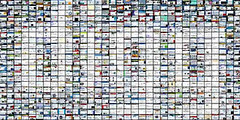
“an interactive photo mosaic of a graphical icon or logo made up of hundreds of relevant website screenshots, demonstrating the concept ‘a picture is worth a thousand websites'”.
(see the original interactive collage at urlyart.com).
Would this interactive visualization make sense in the popular understanding of epidemiology?